Why we cancelled all the newspapers
Bob Wells | Mar 25, 2011

A brief rumination, if you will, about newspapers and why they no longer perch on our doorstep.
About three weeks ago, we cut the cord. Got on the phone and cancelled the Denver Post, Camera and Sunday New York Times. Now, we’re learning how to read all three of them on a Macbook Air that rests on the dining room table each morning where piles of largely unread newspapers had been.
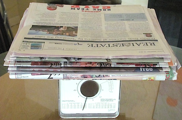
The photo above illustrates one major frustration. The first thing I had to do with the printed newspapers was to laboriously remove all the sections we didn’t want — labeled by me the “junk sections.” These included every advertising section and insert, those hideous half-sized vertical wraparounds on the front of even the sections we did read and — owing to personal taste in our household — the sports section, which only got a short read from me during major tennis tournaments. It’s hard to sell a product to a customer whose first experience of said product each day is to remove from it the hated detritus.
Then there was the matter of what engineers call the “signal-to-noise” ratio. The problem is that one turns pages, and turns pages, and the content that interests (signal) was surpassed many times over by content that didn’t interest (noise). The Sunday Times was equally adept in not catching my interest with its snoozy articles. The papers were only getting a quick glance at the headlines and a few paragraphs on the front page and the local-news section front. The rest was just a pile of dead tree branches. On many days, the papers didn’t even get that much, but were dumped in the recycling bin untouched.
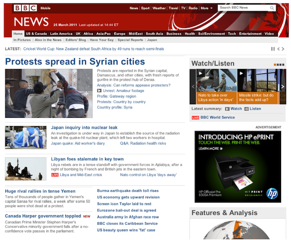
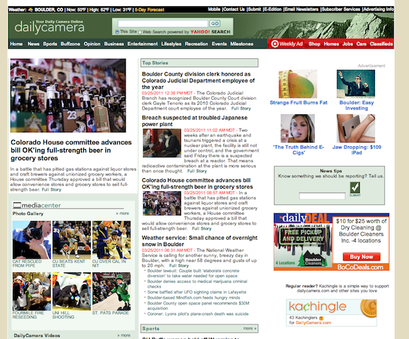
As converts to online reading, we both find the websites’ navigation frustrating. With some exceptions (the beautifully designed Times site being one), newspaper websites lack the easy usability that reflects “best practices” for websites these days. Compare below the front page of BBC News with that of Boulder’s Camera. As an aside, I still haven’t figured out why days-old stories linger on the local papers’ websites for days, posing as piping-hot news.
At this point, it seems clear my time is better served by visiting major aggregator sites (such as HuffingtonPost, DailyBeast, CommonDreams.org, TruthDig.org) and sites that reflect my interests and, yes, my biases. And I often consign even those stories, no matter how compelling and on target, to a queue of “stories to read later,” assembled, of course, via Instapaper.
It’s likely that newspapers’ — er, media companies’ — websites and web apps will get better, because clearly that’s where the eyeballs are going. The iPad and its competitors provide the enabling technology (we sold our iPad and got a Macbook Air because we’re a family of writers who wanted a real keyboard, because we’re used to working with Macs, and because we missed the Flash videos).
True, the pricing model for online news is still unclear. And news producers need to hire more “information architects” and “web usability” specialists to help them do it right. But demand for news, whether local or global, will hardly go away — especially in a time of multiple daunting crises. The demand for news will be served, only digitally.
Quick course in web design
GOOD: The latest stuff is easy to get at on this BBC News front page.
NOT SO GOOD: Camera leaves me grasping: where are the stories that count?
The author is hardly a sideline observer, having labored as a reporter and editor at the Rocky Mountain News, Daily Camera, Detroit Free Press and elsewhere since the days of the linotype machine.
This article also appeared, in slightly different form, on Bob Wells’ blog on Huffington Post.


